Squares Conference 2017

Wow! I am so excited to be here.
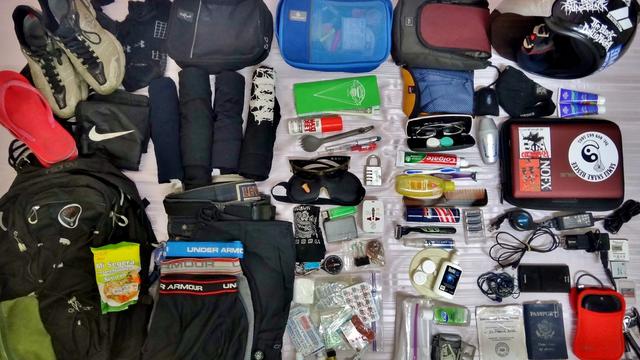
About a month ago when I started preparing for this talk, I was also heading off on a trip where I was going from cold weather to warm weather and looking at all the clothes I had spread out to pack.

I looked at all of these clothes, then to my suitcase, then back to the clothes, and thought, there is no way these are all going to fit into the suitcase, I'd have to take a bigger one. Except that I didn't want to take a bigger one, and didn't really think I'd need all the cold weather clothes for the warm weather, and I didn't want to take the clothes I didn't need, and it dawned on me...

This is a fantastic analogy for describing responsive images and all the ways that we can increase site performance.

Of course, the first thing I'm going to do is cut down on the size, well, not really the size, but sorta the size, of my clothes. I'm going from this large fluffy down winter jacket to this light spring jacket. That's the same as resizing my images. No sense in packing a giant winter coat I'm going to use only to get to the airport, and no sense in delivering a 4k image to a device that has a screen width of 640 pixels.

So, I'm going resize my images down from that 4k to the 640 pixels, and deliver that smaller image to the browser.
Resizing images is the most effective thing we can do on image heavy sites, to reduce the size of our web pages, and increase site performance.

But wait. What does that mean, "increase site performance"? And what do I mean by the size of our web pages and why should I care?
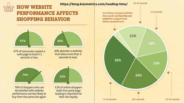
Study...
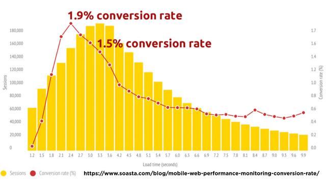
after study...

after study
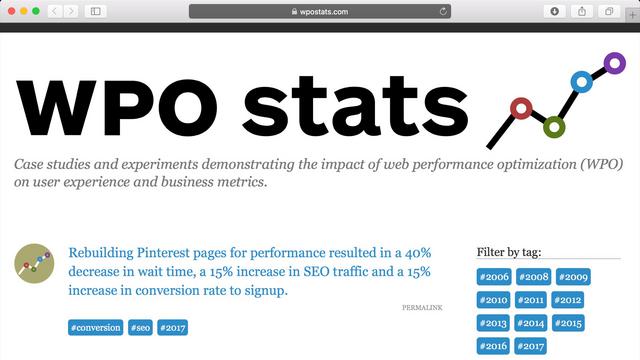
show that users are likely to abandon your site takes longer that three seconds to load. Slow performing sites frustrate their users, and reduce the likelihood of return visits and, in the case of commerce sites, purchases.

In terms of loyalty, slow sites are perceived as clunky and frustrating. Not terms we want to be associated with our site.
So, why should we care? We care because we'd like to have visitors happy with our site.

All the metrics that we test track, from the number of bytes we send for a page which is the page weight, to document complete time, from start render, to the speed index, all of these metrics are just proxies for user happiness. For externally facing sites dedicated to an audience, that's what we care about: their happiness with our site.
That happiness is linked to our sites' performance.

The first thing we want to do understand how fast, how performant, our site currently is, get a baseline. In my packing analogy, I think this is kinda like how fast is my airplane, but really, it's more like, "How long is my overall travel time?"
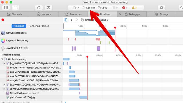
To do this, we can use our browser. Open up our developer tools, open up the network tab, clear our caches, and reload the page. This is a first order approximation of our site size and loading time. We can watch when the page first loads, or doesn't load, depending on our network connection and browser selection.
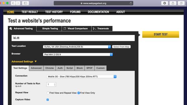
A more robust solution is the industry standard for website performance testing, webpagetest.org
Love, love, love WebPageTest for these things. When talking about metrics, we need to check more than a single page, say, the home page. We want to check the different pages that represent the different parts of your site, so yes, the home page, main content page, product page, collections page, and so on.
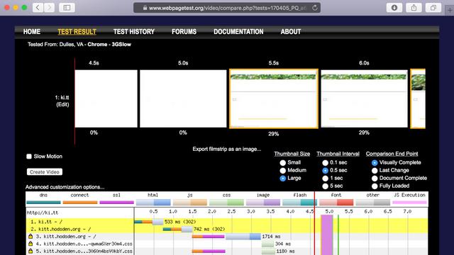
With webpage test we can track performance data, including page size, page weight, and loading speed simulated by different connection speed, and speed index, and all the metrics you can pack.
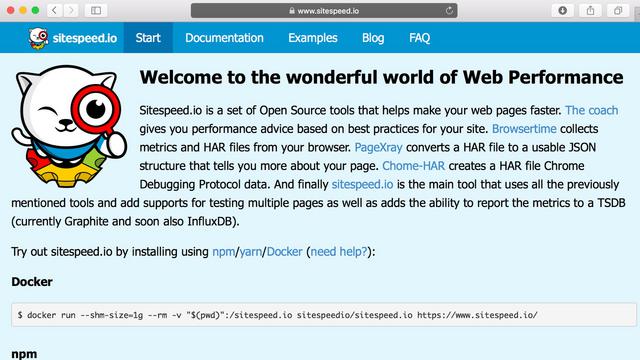
If you are sharing your site performance metrics and want a faster way for quick dashboards and tracking performance metric trends, I recommend Sitespeed.io
It has similar functionality to webpagetest, but has clients for all major browsers. Also, Sitespeed's setup is dockerized, which I find easier to set up quickly for new projects.
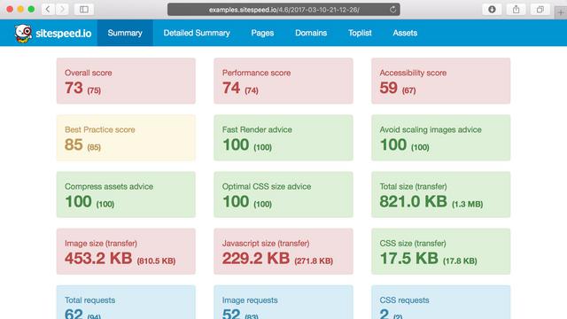
It has built-in wonderful summary pages available to quickly glance at the metrics you might be concerned about.

Okay, so, I know how much I'm currently packing on my trip and how long my flight is, ...

I mean, we know how fast our site is, and what assets we load. we have these various metrics. The number of them can be overwhelming.
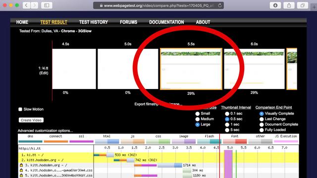
The one I typically concentrate on when working on a client's site for the first time is the start render time. That is the time for the first visible changes to appear to the user.

That's the point when the user sees something happening, that's the happiness part.

So, these metrics. We want to improve them. How much? How much is good enough?

How do we know when we have achieved this "good enough" state, and how do we know when we've added one too many new features to our site, degrading our performance?
A performance budget is one way to state the performance goals of your site.
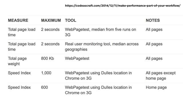
A performance budget is one way to state the performance goals of your site.
A performance budget is a set of numbers for the maximum page size, time to user delight, and number of requests you are willing to have for your site. You can track these and know when your page has gone over in specific metrics.
There are a number of sites that can help you understand what web performance budgets are - this is the subject of a whole other talk

There are a number of sites that can help you understand what web performance budgets are - if you search for "web performance budget" you can find a large number of resources, including talks by Tim Kadlec.

You will find sites in those results that will help you calculate the limits for your assets. Giving you a warning when you'll go over.

For other statistics such as browser information and device resolution, analytics software can determine those for you, just please, please please, don't overdo these.
External trackers can crush your performance, taking your hard earned 4 second to load website into the 10, 20, 30 seconds of loading time.

Not overdoing trackers is a small part of the three categories of changes we can make to our websites faster in general.

Deliver less content

Deliver content faster
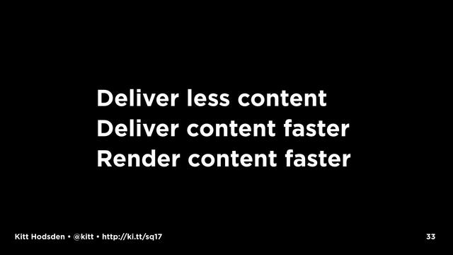
Render the content faster

Okay, here is where I'm going to go a little hand-wavy on things.

I'm going to talk about the general case, using statcounter.com global statistics, which is the source of caniuse.com's usage statistics. along with httparchive.org, which tracks site statistics for the top ten thousand Alexa sites.
Which means, if you ask me how you should pack for your flight and which flight you should take, which of the techniques beyond image resizing should implement, beyond my first answer of "Why, all of them!" I'm going to actually answer "It depends."

Depends on your page size, the content on your page, and how your users' get the content on your page. In particular, their devices, their networks, and their browsers

This data is in your logs. I don't have access to that data. I can talk in the general sense, give you statistics, tell you what's going on in general, but your site is somewhat different than mine.
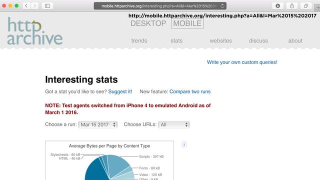
To the general size, I'm using the statistics from httparchive.org, which tracks site statistics for the top ten thousand Alexa sites.
How many people here work on one of the top ten thousand Alexa sites?
Me, neither.
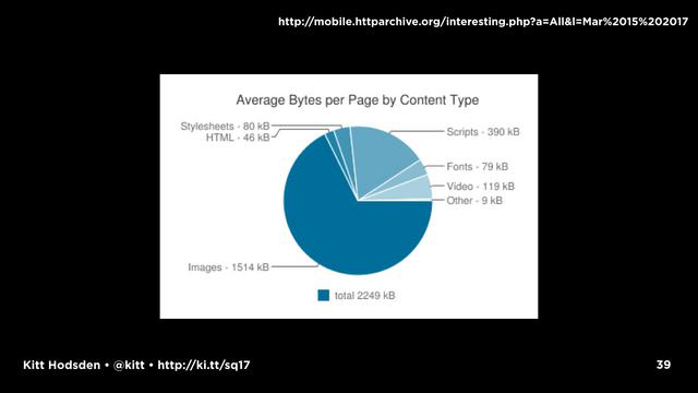
Lookinat at the top 10000 sites, we see that, to no one's surprise, Images are the biggest part of content.
For these 10000 sites, images made up 1.7MB of the 2.6MB average page size, or just under 66% of the page size. Which means, we can and should, as everyone else has for the last many Internet years, go for the low hanging fruit and reduce image file sizes. I mean, if we can reduce our images by 50%, we've saved 30% of our page size.
Note this is the _AVERAGE_ Video heavy sites, for example, this is totally different.

This chart tells me, I need to pack a smaller amount of clothes. I can choose the light jacket over the winter coat, that sort of thing. What I chose and how I choose to pack them in the suitcase is important. I can toss the clothes in the suitcase, I can fold them mostly flat, or I can roll them into a cylinder.
Similarly, with images, WHAT image format I use and HOW I resize the images can be more important.

So, really quickly, the four image formats that have been around for a long enough time that we can say just about every web developer is familiar with them.

GIF is a common image format, perhaps most well known for animated images, but really was the first common image format. It is lossless, meaning you don't lose details when you save files as GIFs, but you could lose color depending on your color choices, with GIF being 8 bit indexed color. You have 256 colors.

PNG is a more modern replacement (in response to a patent licensing fees) for the GIF image format. It is also lossless, and supports transparency. PNG has a number of different flavors: an option for 8bit color, but is also 24 bit color, with a transparency channel, and you can make the file really big with 48 bit true color. It doesn't support animations. Size-wise, PNG is a good choice for images with few colors.
APNG image format, but the support is small, so I'll keep with the handwaving.

We have SVG for vector images. Most logos, many icons, and a large number of images can be done as SVG images or icon fonts.
SVGs are great for so many reasons, the least of which is that they scale so well, given the vector format. The files are text, so are typically tiny compared with the gif or png alternative, and we don't need to have resized versions.
SVG files can be sprited, the technique of including many smaller images in one single image, then using CSS to display only the part of the image you want, reducing the number of image files requested.

And we have the most confusing, most flexible, least understood format, JPEG.
Can you tell I have opinions about this format?
JPEG is a lossy compression file format. We can make the file size smaller by throwing away data, the "lossy" part. It's what we get for most consumer cameras because it is great at compression for MOST photos - images with many colors and low contrast.

It does a very poor job when you have lines or hard edges
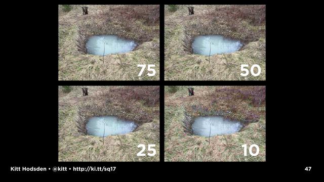
The lossy part of the compression part means that you can toss data out, compress it, and still have a sufficiently good photo. This is typically what the quality option is when JPEG images are resized.
If you use the defaults for most image resizing, say, with Photoshop and save for the web, you have the quality image default of 60, resulting in images of a specific size that are fine. "fine" - depending on your use case, screen resolution and dpi, and your expectation of "fine."

With the lossy part of the JPEG image we have a whole lot of buttons and knobs other than the "quality" dial you can turn to adjust how that compression is done

Dave Newton from Shopify has this fantastic talk, and a Smashing Magazine article about parameters that can be used when adjusting images.
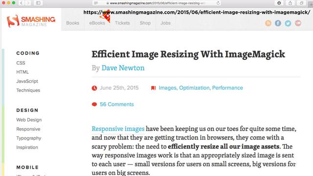
Dave notes that using parameters he's selected, the resizing process takes twice as long as with the default resizing values, but produces images that save almost 20% of the file size, without reducing the visual acuity of the photos.
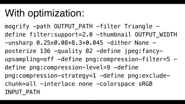
Dave includes a summary of what you do for similar results, along with his data.
Most people cannot tell the difference between the images, but they are 20% smaller. That's a pretty good win.
What we also learn from Dave's research is that you do NOT want to use Photoshop's resize and save jpg files without optimization.

A recently released compression technique is Google's new guetzli JPEG encoder, which enables a higher compression with less perceptual loss - there is loss, JPEG is a lossy format, but you can't tell, which means you can compress the files into fewer bytes, but they still look good.

Of note, on my early 2015 mac book pro, this 4k image took 17 minutes to process, so the encoder isn't cheap, it is computationally very expensive. But it is effective. My test image went from 3.8MB in size, down to 1.9M.
I'm not likely to be delivering a 4k image, though

My 1K image went from 383k to 175k, taking less than 2 minutes to process.
This demonstrates the point that how you encode your image, and what quality level - JPEG is lossy, you can choose how lossy - is used in important

Those are the common formats that have been around for a long time (FOREVER in Internet time, eh?).
Another format worth mentioning is WebP, a modern image format that has both lossless AND lossy compression, AND smaller file sizes, around 35% smaller
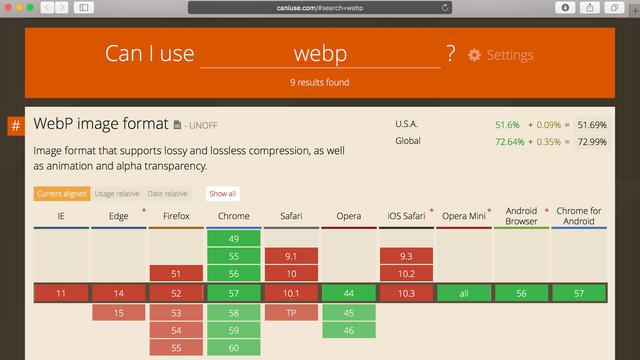
While WebP is not universally supported, this is the case where, for _your_ website, you want to check your logs to see what browsers are worth going the extra distance to support.
For my personal website, which has a hundred visitors a month, and my mom is one of them, I know that supporting Chrome is worth the effort.
Yet, a client of mine is exclusively Safari and mobile Safari. Adding WebP isn't an effective use of resources for that project.
For most sites on the open web, a good number of visitors will be using Chrome, so while webP is newer on the block, it might be worth supporting in addition to other formats.

WebP has a complementary WebM format for moving pictures,
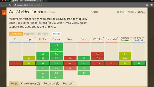
Also with fairly broad support.
Check your data to see if they are worth supporting.

If it's a photo, use WEBP and JPEG.
If it's in a vector format, or can become one, use SVG.
If you want to have an animated GIF, use SVG if you can, MP4 and WEBM if you can't.
Use PNG for everything else, unless another format is smaller.
Use the smallest image size that has the image fidelity you need.

So, how do we include the different formats in the webpage? If we were going to include, say, webp images, how would be go about doing it?

There are three fairly well-supported ways to include resized images in a page. I say fairly well-supported, because they aren't all universally supported in all web-browsers, but really well-supported for modern browsers.
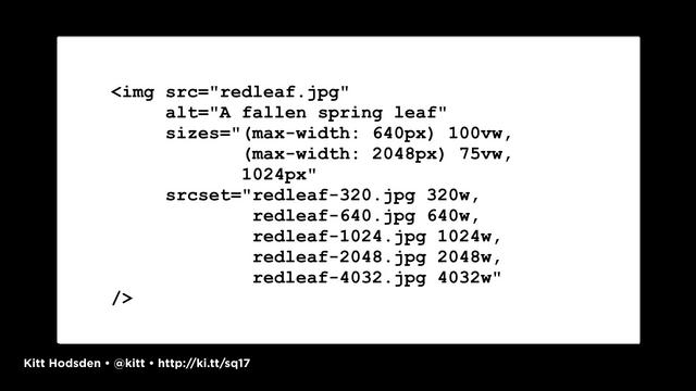
For just image resizes, we have the srcset and sizes.
We use srcset to list the different sizes available, and media queries to indicate which image we want the browser to use.
srcset and sizes are great for different sizes of the same image in the same format.
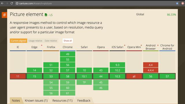
For art direction, where images are cropped differently, OR when we have different image formats we want to support, the picture element is the one to use.
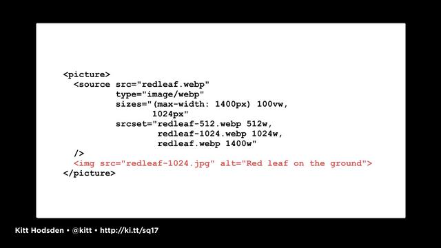
With the picture element, you have your default for any browser that doesn't support the picture element, which should be selected based on your analytics data for your most common visitor.
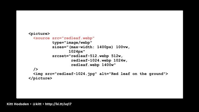
Then sources for your other images.
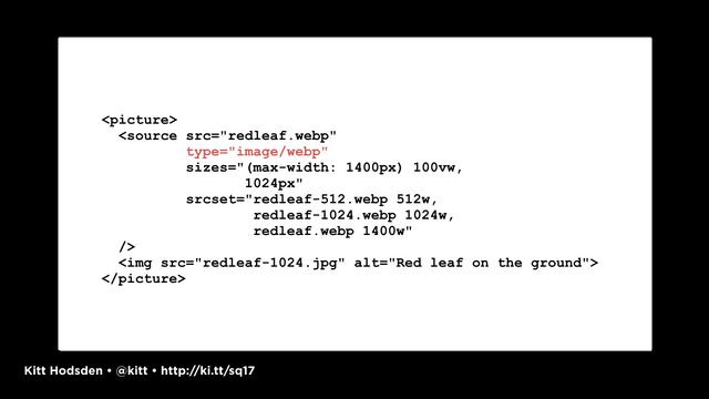
The mime type attribute in the source element tells the browser that image format is available, and the client chooses.
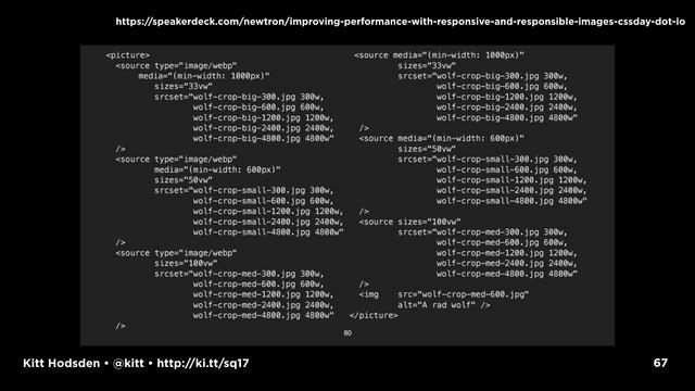
We can combine all of this with the srcset and sizes and, wow, we have a mess. Please never make me write all of that out by hand. Use helper functions.

If you are supporting older browsers, there's picturefill to fill in the feature gaps. Again, this is "check your statistics"
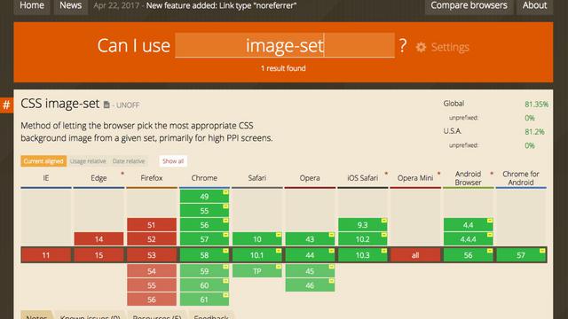
The third way to include resized images is with image-set.
From my experience working with client legacy code, image-set the lesser known of the three image syntaxes, but still very powerful way of including different image sizes is with the image-set CSS notation
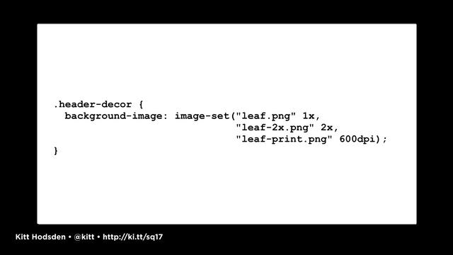
It is the same syntax as srcset, but for CSS, which is fabulous when we have background images we want to adjust. If we can't use SVGs or CSS to generate the background we want, use image-set keep from using huge images in the background.
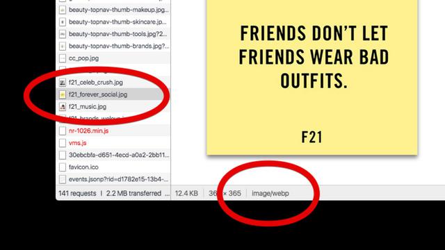
Now, if you're a back-end developer and have access to the User-Agent string, you can cheat a bit. Web browsers will render an image if they can. If a browser requests a jpeg image, and you know it will support a smaller webp version that you happen to have handy, just send the webp version.
The browser will use the response headers to determine what to render, not the request headers, and you're good to go.

Okay, so with the image formats, we've selected the right size. We've included it in the HTML. But have we really made them as small as we can?
Likely not.
This is yet another part of the HOW you resize comes in.
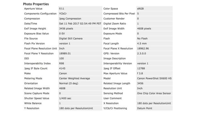
For example, a very small part of what can be removed includes the EXIF data in an image.
Each of the image formats supports having meta data in the files. These are things like the camera information, image exposure, things like that. You can embed your copyright information in this EXIF data, too, if you need to.
With PNG files, even though they are lossless images, the data size can be reduced by the way the data is stored in the file. Say, you save an image as a PNG-24, but you have fewer colors.
PNG files include color correction data, too. I haven't calibrated my monitor or adjusted its gamma since I worked on Shrek 17 years ago. And while I'm only one data point, I'm good with removing the calibration data from my PNG files on client projects, too.

Converting the files to the different formats should be added to the image processing pipeline that you might already have. Gosh this just can't be done by hand.
Optimizing files by compressing the image and removing extra clutter should happen in the same pipeline.
Shell scripts are one way to do this. Node scripts and javascript task runners are another way to do this.

So, examples!
For my examples, I'm going to use ImageMagick, it is cross platform (including iOS, if you are inclined), incredibly flexible and stable. GraphicsMagick and GD are two alternatives with their own quirks.

...and has libraries should the command line not be in your current image pipeline.

On MacOS, we can use homebrew to install the various packages we need to do our conversions. On linux you have your package manager apt or yum, on Windows you have Chocolatey.
On mac, we can also install webp to convert images to the webp format, and guetzli if we want to try out the jpeg compressor.

ImageMagick comes with two main programs for manipulating images, convert and mogrify. In general, convert is great for single images, multiple processes, and testing options. mogrify is used for batch, but operates on the files IN PLACE by default. You will overwrite your original images if you don't specify an output path!
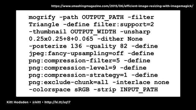
Please don't type that in every time.
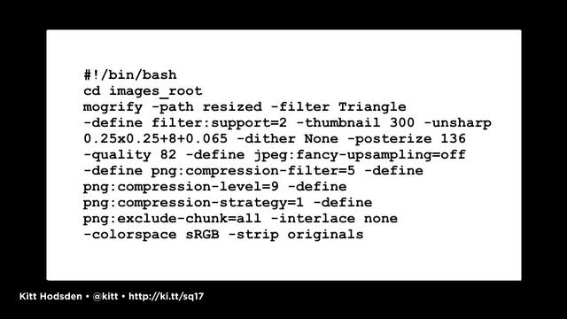
Put it in a bash script
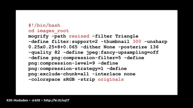
With your configuration, of course.

Recall, this is where we can resize images. But we want to optimize them, remove all the unused data and compress the data we want to keep.
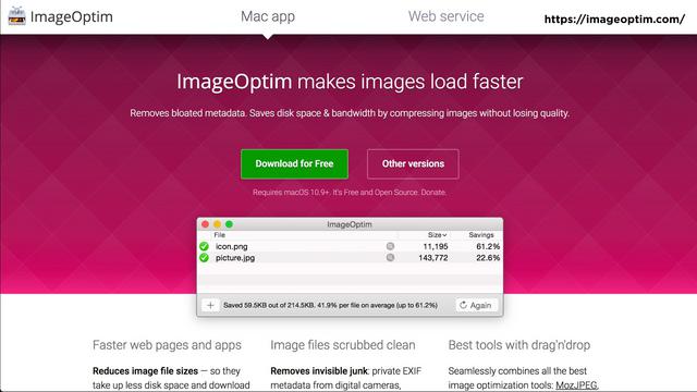
If we are on the mac, we can use ImageOptim, and add this to our command line script.
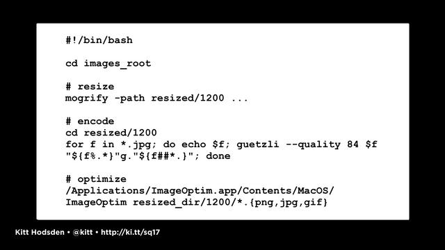
And we can chain together with the optimization
If we aren't on the mac, we have other image optimization options.
For example, the nodejs ecosystem is incredibly vibrant with options for resizing and optimizing images. grunt, gulp, web pack all of options.

A quick gulp example that isn't thorough by any stretch, gives us a chance to resize, re-encode a JPEG image and optimize it in one operation without having to write intermediate files.
A caution on removing all the EXIF data for jpeg images. One of the pieces of information in that EXIF data is image orientation. Rather than adjust the pixels, cameras will save which way is up with the picture in the EXIF data. If you strip this information before you adjust the pixels, you'll end up with images displaying upside down. jpeg-autorotate will rotate the images before stripping the data.

Should I continue the travelling analogy? One can sometimes go overboard with the analogy, but in this case, I am convinced I have packed my bags as best I can. I have only the clothes I need (my images are as small as they can be), I have selected the clothes that pack the smallest (my images are of the right format), and I have packed them tightly together where I could (I've combined multiple small images into a single sprite if I can).

My next step is clearly to get to my destination as quickly as possible. For images, this means we want to deliver our images as quickly as we can. There are limits in this, of course, as we don't control the user's network. Once the data has left our servers, it's out of our control.

Browsers are optimized to get content as quickly as possible. We can use that to our advantage.
Your infrastructure and server tuning play important roles in delivering content. For example, Amazon S3 is not a CDN, CloudFront is. If you are using s3, tune it.
CDNs provide servers closer to the end user, reducing the amount of latency between an asset request and response. A medium traffic'd site can benefit from the use of a CDN, for example.

Another easy win in delivering content faster, don't do redirects. An example would be on SSL sites, have all your URLs be https:// don't mix and match and have the non-ssl redirect to the ssl or the other way around. SSL had a bad rap about being slower way back when, which I'm not is valid and is worth the experiment to see if your site on SSL-only is any slower.

Cache your images into the next decade! If you deliver an image once, don't deliver it again on the next request, let the browser hold on to it! Set your headers appropriately.

Last-Modified headers are sent with an image so that the browser can, when requesting the file again, send the timestamp with the request. "Hey, I have this version, do you have something newer?" The server can check and indicate, nope, you have the most recent, or here's the latest.

Etag is a unique identifier given to each version of a file. The server sends it with the original file, and the browser keeps track of it, sending it back with subsequent requests to see if things have changed.

Expires says, keep this file until this date. The browser won't contact the server until the Expired date has passed. This is a good one.

Max-Age says keep this version of the file until this number of seconds have passed.

If you have the resources, experimenting with the infrastructure is worth your time. Maybe you want to reduce your TLS handshakes and your DNS lookups by having images on the same domain, or maybe you want to fine-tune your image servers by reducing the number and size of your headers, say by having no cookies, on a secondary domain.
A side advantage of having your images served from a different domain than your main site content is that, should you decide to move your images to a third party provider, it might be a lot easier to adjust the DNS in one place, and point it to the service, then adjust the URLs in your site.

But then there's the protocols. Many of the work arounds for performance that have been recommended, and even some I've mentioned with spriting and having a secondary domain for images (sharding), are the result of enabling multiple connections from the browser to the servers to speed up downloading.
The http/2 protocol does away with some of the latency issues surrounding the request for assets by multiplexing, allowing multiple streams of data to flow over the same connection.
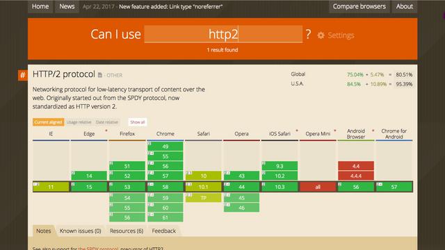
It isn't universally supported, but is supported very well over SSL
This is one that is worth the time to experiment, even though it will affect the rest of your asset pipeline. If you don't need to concatenate javascript files that are changing frequently, and you can still deliver them quickly with http2, what you concatenate changes in your asset pipeline.

All right, we have our smallest images delivered as quickly as possible. We are caching them until high noon of next year.
Next up then, we want to render them images as quickly as possible. We are going for that user happiness metric, time to first render. We want our users to see something quickly!

In our case, that means optimizing the critical rendering path. Let's have no headwinds on the flight.
Optimizing a site's critical rendering path is incredibly specific to a site's content, layout, and functionality. To start going into depth on this topic would be to begin a talk that would have you pulling out your sleeping bags and cozying up for the night.
So, instead of putting you all to sleep, the highlights! And references to other talks and workshops and resources.

HEY! There are a few available! I recommend Ilya Grigorik's Fluent talk, followed by a number of his Velocity talks.
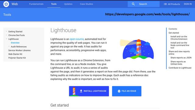
I would also like to suggest trying Google's Lighthouse. You can install it as a browser extension, or as a standalone node-based application.

In particular, the Critical Request Chains. It can help you identify which resources and assets are currently prioritized, and use this information to adjust your HTMl so that the important assets are downloaded first, resulting in better rendering performance.
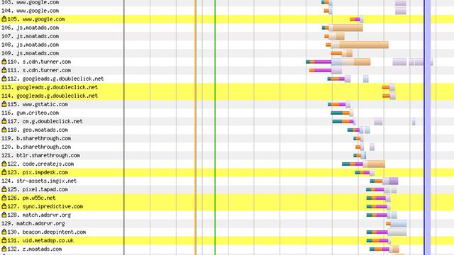
Recall those trackers that I commented on early, load them all async. Don't let another site prevent your site from loading.

For images, the easy wins.
"Above the fold" is the term referring to the part of your site usually the top, initially visible without any scrolling. On a phone or tablet, that's usually in portrait mode. On the desktop that's usually in landscape.

Images that are located in this area should be included in the HTML directly, with your image or picture elements...

...not in CSS as a background image, and not lazy loaded.
Why? We want the browser to do the heavy lifting for us. Images as CSS background images can't be preloaded

To make loading faster, browsers will download images found during the HTML parsing, before the HTML has started rendering. If you reference your images in your CSS, not only does the CSS need to download, it needs to parse, too, before the image is found.

Loading a smaller placeholder image, or inline data image provides a great user experience, the user will see something begin to render on the screen (happy!).
The image can be a data:url placeholder image, maybe a solid color, display, or load a tiny tiny image that's small and upscaled by the browser as the placeholder.
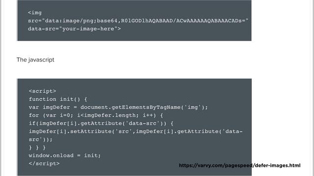
Once the initial load is done, trigger the downloading of the full sized image.
We can keep this javascript small, so that it'll load in the first 14kb of the page, which is the size of initial burst of data from the server.

For the images below the fold, the best solution might just be not loading it at all. Hey, if the hotel has towels, no need to pack mine!
If you have images below the fold, content that a user has to scroll to get to, and the user never actually scrolls to see it, don't load it in the first place.
Recall, however, that this means that the images won't start loading until after the HTML has been downloaded and parsed, and the CSS has been downloaded and parsed, and the Javascript has been downloaded and parsed. And we are talking images outside of the visitor's current viewport.

Again, you load the placeholder image.
This 60 by 40 image is less than 900 bytes in size.

When the site visitor is scrolling down the page and hits a waypoint, before the image is about to come into view, trigger the image load.

Trigger the image load and load before the image scrolls into view.
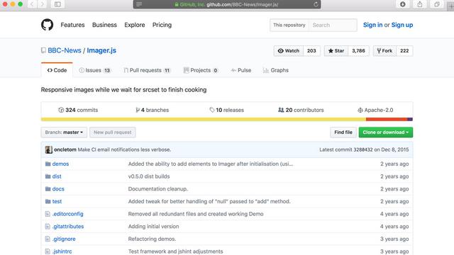
So, if you go with a library on this, or as a jquery plugin, all that javascript needs to download and parse and execute before it can start acting. Probably okay for below the fold.
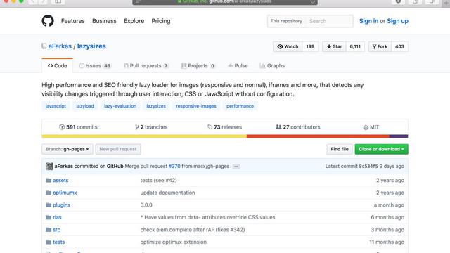
There are a number of javascript libraries for lazy loading, including some jquery plugins and react components.
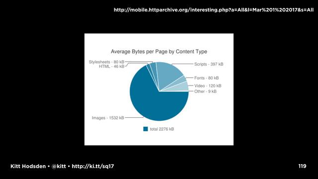
I want to repeat that some of these techniques and ideas may not apply to your site. If you look at the latest httparchive statistics, for all websites, images are 60% and the page weight is 2.2Mb, this is is a growing number historically. Look at the images!
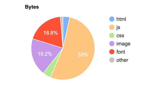
But if you look at CNN.com in particular, the page is 53% javascript. Optimizing the images isn't the first place to start on that site.
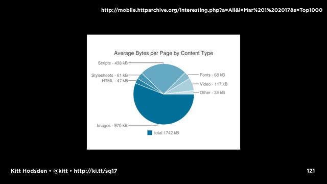
If you look at the top 1000 Alexa sites, the page sizes are 1.7Mb, but images are only 970kb

Look at the top 100 a month ago, and the total page size is 922kB. It's like someone understands that a smaller webpage is important to performance!
Images are only 527kB. That's fantastic!
These stats are 3 weeks old. I looked this morning and those values have nearly doubled in the last two weeks, which makes me a little sad.
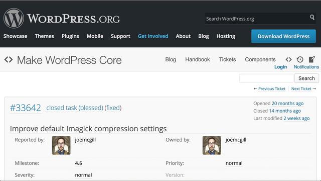
But, we all want to make the web better. Many frameworks are following suit and improving the image resize configurations. Wordpress for example, updated the default jpeg quality value from 92 to 80. Millions of websites just started serving images 20% smaller. That's wonderful!
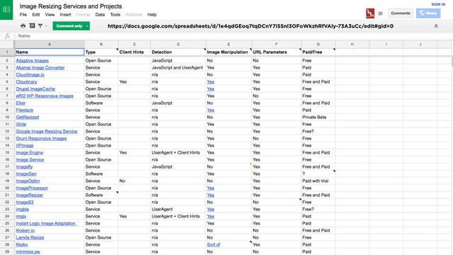
And as much as I want to say, hey, do these steps to automate this, set up this cron job to resize images when they are uploaded to X directory and run your optimizer, or add it to your grunt gulp webpack workflow, the reality is that many times you just don't have time to do these things. If you don't have the time or the resources to experiment to find what is best for your site, there's nothing wrong with outsourcing this stuff.
There are companies that do this and do it well.

Cloudinary, for example, does a stunningly good job at this.
Okay, so, packing for this trip, I made a lot of suggestions for small and big changes for increasing website performance, so an acronym is in order.

Easy enough to pronounce. Even easier to remember.




Because the user's happiness isn't the only important part of your website. You, the designers, and developers, and your devops, your happiness is important, too.
That was the picture that came up for "developer happiness" in a flickr creative commons image search. Seemed appropriate.

I'm really happy I was able to pack efficiently for this trip, and grateful for your time. Thank you!
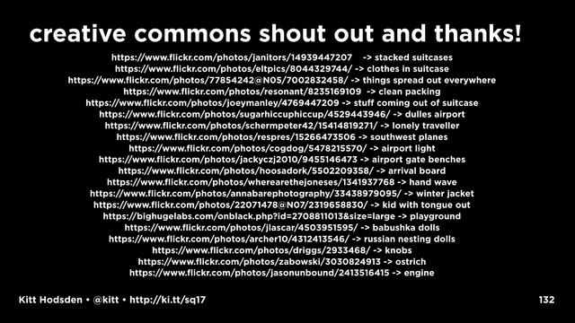
https://www.flickr.com/photos/janitors/14939447207 - stacked suitcases
https://www.flickr.com/photos/eltpics/8044329744/ - clothes in suitcase
https://www.flickr.com/photos/77854242@N05/7002832458/ - things spread out everywhere
https://www.flickr.com/photos/resonant/8235169109 - clean packing
https://www.flickr.com/photos/joeymanley/4769447209 - stuff coming out of suitcase
https://www.flickr.com/photos/sugarhiccuphiccup/4529443946/ - dulles airport
https://www.flickr.com/photos/schermpeter42/15414819271/ - lonely traveller
https://www.flickr.com/photos/respres/15266473506 - southwest planes
https://www.flickr.com/photos/cogdog/5478215570/ - airport light
https://www.flickr.com/photos/jackyczj2010/9455146473 - airport gate benches
https://www.flickr.com/photos/hoosadork/5502209358/ - arrival board
https://www.flickr.com/photos/wherearethejoneses/1341937768 - hand wave
https://www.flickr.com/photos/annabarephotography/33438979095/ - winter jacket
https://www.flickr.com/photos/22071478@N07/2319658830/ - kid with tongue out
https://bighugelabs.com/onblack.php?id=2708811013&size=large - playground
https://www.flickr.com/photos/jlascar/4503951595/ - babushka dolls
https://www.flickr.com/photos/archer10/4312413546/ - russian nesting dolls
https://www.flickr.com/photos/driggs/2933468/ - knobs
https://www.flickr.com/photos/zabowski/3030824913 - ostrich
https://www.flickr.com/photos/jasonunbound/2413516415 - engine
Resources
https://blog.kissmetrics.com/loading-time/
https://www.soasta.com/blog/mobile-web-performance-monitoring-conversion-rate/
https://calendar.perfplanet.com/2013/slow-pages-damage-perception/
https://wpostats.com/
https://calendar.perfplanet.com/2013/slow-pages-damage-perception/
https://webpagetest.org/
https://sitespeed.io/
https://codeascraft.com/2014/12/11/make-performance-part-of-your-workflow/
https://www.keycdn.com/blog/web-performance-budget/
http://www.performancebudget.io/
https://mondaynote.com/20-home-pages-500-trackers-loaded-media-succumbs-to-monitoring-frenzy-9efeb389cbbd
http://gs.statcounter.com/platform-market-share/desktop-mobile/united-states-of-america#monthly-201603-201703
http://mobile.httparchive.org/interesting.php?a=All&l=Mar 1 2017#bytesperpage
https://speakerdeck.com/newtron/using-imagemagick-to-resize-your-images-fsto
https://speakerdeck.com/newtron/improving-performance-with-responsive-and-responsible-images-cssday-dot-io
https://www.smashingmagazine.com/2015/06/efficient-image-resizing-with-imagemagick/
https://github.com/google/guetzli/
https://arstechnica.co.uk/information-technology/2017/03/google-jpeg-guetzli-encoder-file-size
http://caniuse.com/#search=image-set
http://caniuse.com/#search=picture
https://scottjehl.github.io/picturefill/
http://caniuse.com/#search=srcset
http://caniuse.com/#search=webp
http://webmproject.org/
http://caniuse.com/#search=webm
http://imagemagick.org/
http://imagemagick.org/script/develop.php
https://github.com/google/guetzli/blob/master/README.md
https://www.smashingmagazine.com/2015/06/efficient-image-resizing-with-imagemagick/
https://imageoptim.com/versions.html
https://www.npmjs.com/package/jpeg-autorotate (node)
https://github.com/savolai/JPEG-Autorotate (windows)
https://betterexplained.com/articles/how-to-optimize-your-site-with-http-caching/
https://http2.github.io/
http://caniuse.com/#search=http2
https://www.igvita.com/slides/2013/fluent-perfcourse.pdf
https://www.youtube.com/watch?v=PkOBnYxqj3k
https://developers.google.com/web/tools/lighthouse/
https://developers.google.com/web/tools/lighthouse/audits/critical-request-chains
https://andydavies.me/blog/2013/10/22/how-the-browser-pre-loader-makes-pages-load-faster/
https://varvy.com/pagespeed/defer-images.html
https://github.com/BBC-News/Imager.js
https://github.com/aFarkas/lazysizes
http://mobile.httparchive.org/interesting.php?a=All&l=Mar 1 2017&s=All
https://cnn.com/
https://core.trac.wordpress.org/ticket/33642
https://docs.google.com/spreadsheets/d/1e4qdGEoq7tqDCnY7iSSnl3OFoWkzhRfVAly-73A3uCc/edit#gid=0
https://cloudinary.com/
